Devlog 4 - Art and Animations
I wrote this devlog about 2 weeks ago, ready to post at a better time, but kept forgetting, so here it is now! I'll post another one today that should've been posted last week, then tomorrow after I finish off the last little touches, I'll post the post-mortem. Enjoy!
For this game, I wanted to challenge myself to do as much of my own art as I possibly could. I was partially familiar with pixel art already, so I chose to use that medium, but I knew animations would be a challenge. I made some initial sketches of my ideas in Aseprite before starting my game, then hired a pixel artist and animator to make a main character for the game.
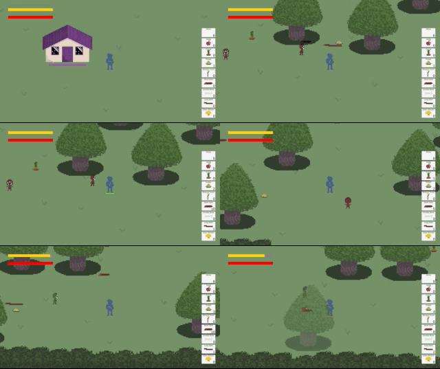
Since recieving the design of the main character, I started work on making my art fit with the artist's colour palette and style better. I made everything darker and removed black outlines of all the collectible items. My ideas started with the tree design, which has changed very little since my original, apart from the colour changes. I implemented all the things I had made colour changes to, and already my game was looking less like a prototype, even though the tree boarders were still white lines and the house was still a purple box, and the zombies were still various sized green shapes.
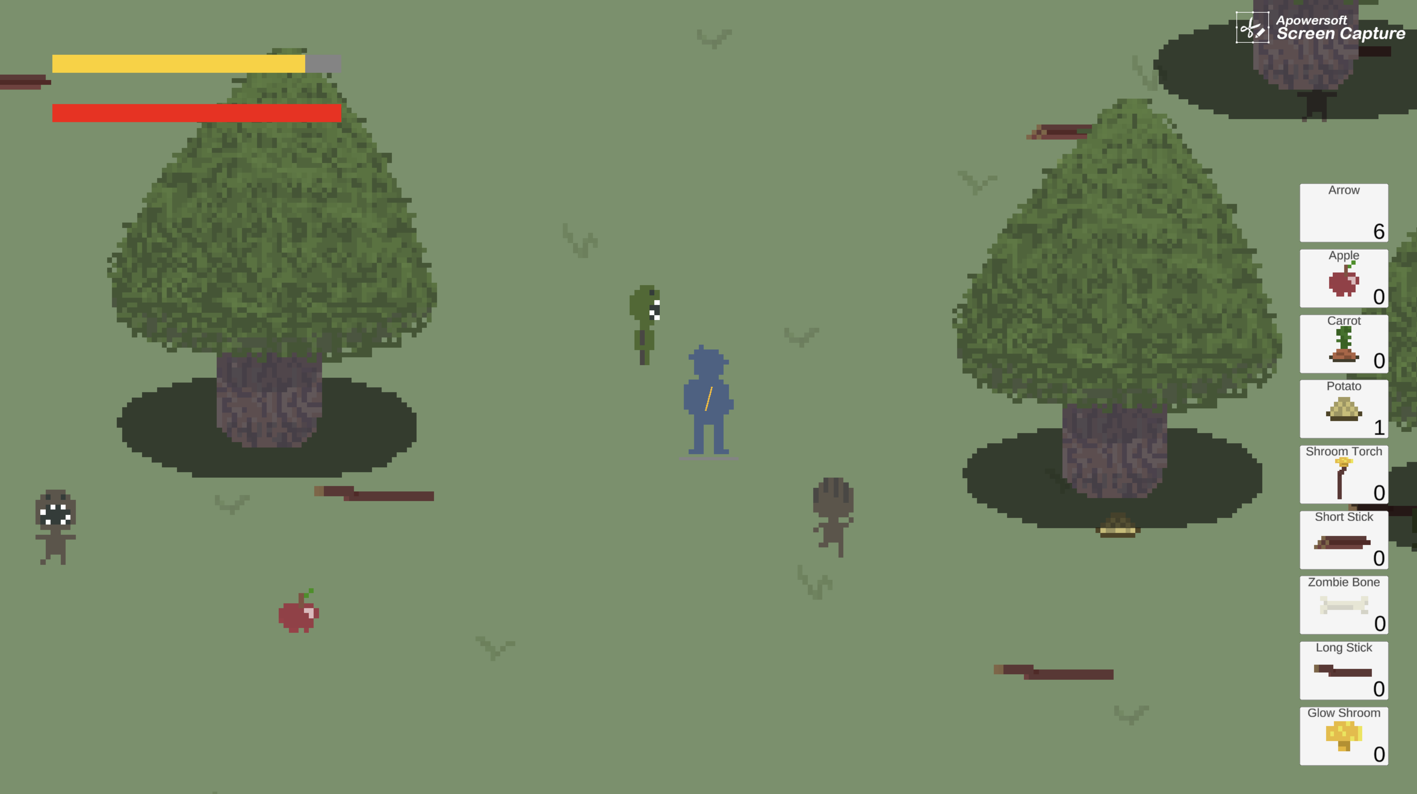
I originally planned to find animations of zombies to purchase online, but nothing was really cohesive with the new style the game was morphing into. Most zombies were too big, and the smaller zombies had black outlines. I decided to make my own, but I do not have much skill in animation, so I decided to have three colours of zombies instead of three sizes. Small became green, medium became brown, and large became red. The zombies I made ended up being nowhere near as detailed as the main character will be, but it's the best I could do with the skills I have. One day, I may hire the artist again to make the zombies properly.
The hardest part to implement was the trees. I wanted the player to be able to go behind the trees and have them become transarent, or go in front of the trees and have them be solid. I like that the zombies can hide from the player and the player can hide from the zombies with this method. In the end, the trees were not perfect, the player can make the tree treansparent while standing in front of it occasionally, but I feel that the effect is believable enough and the small bug is hardly noticable during actual gameplay.
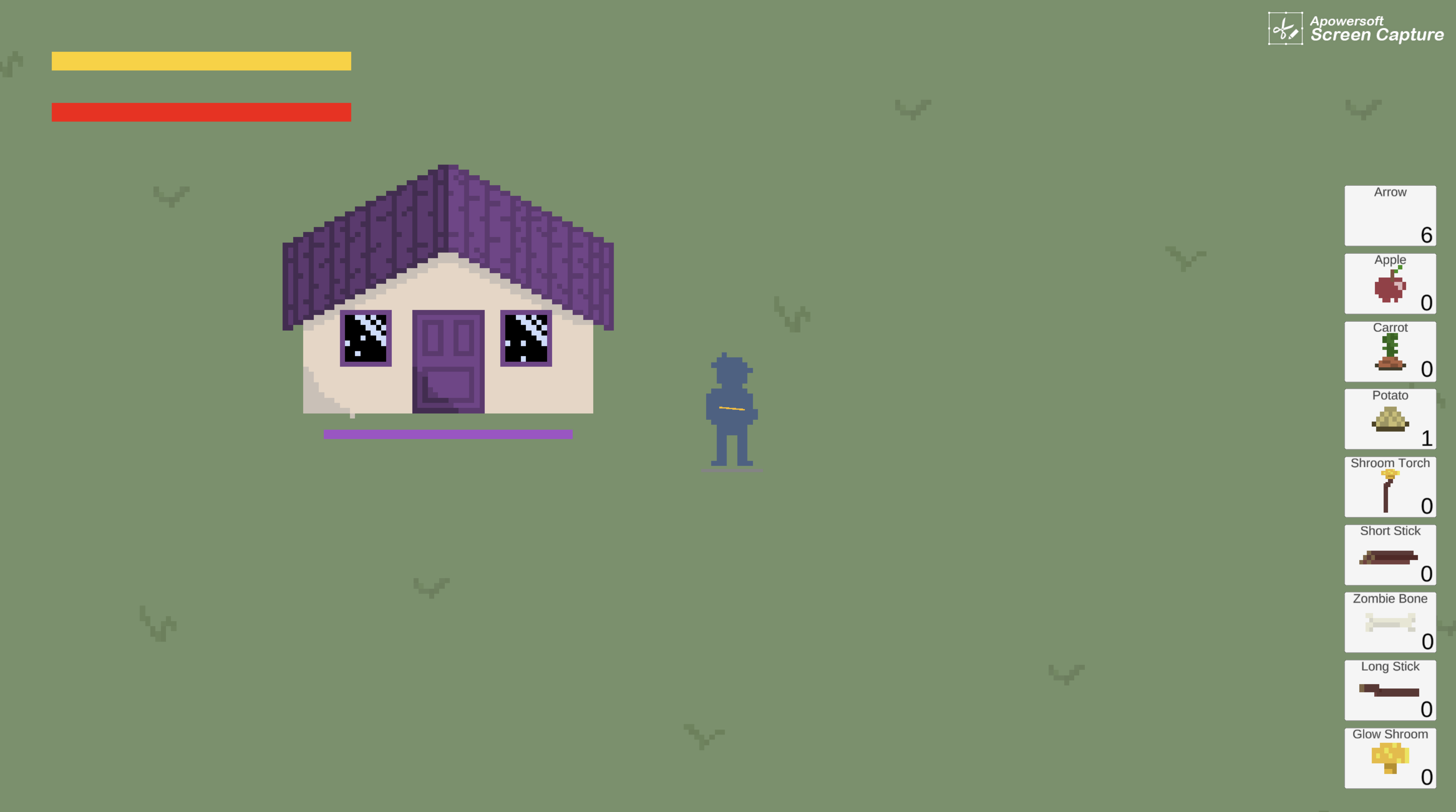
I designed the house to be more brightly coloured than the rest of the world, as it signifies purity in the midst of disaster. It's something worth protecting. I feel as though the house looks a little flat if you look at it for too long, but overall I like the design and I think the roof colour and pattern is effective.
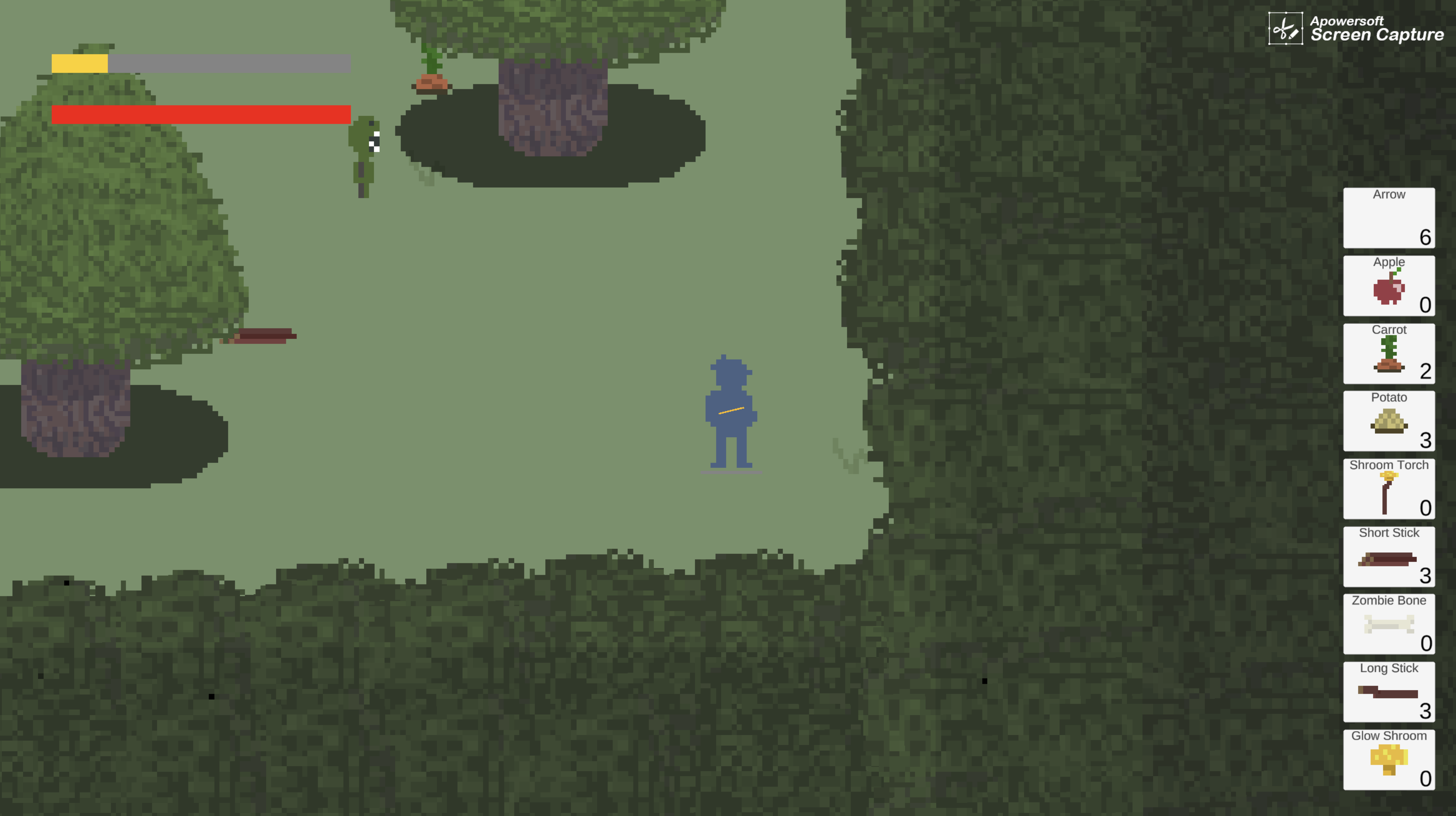
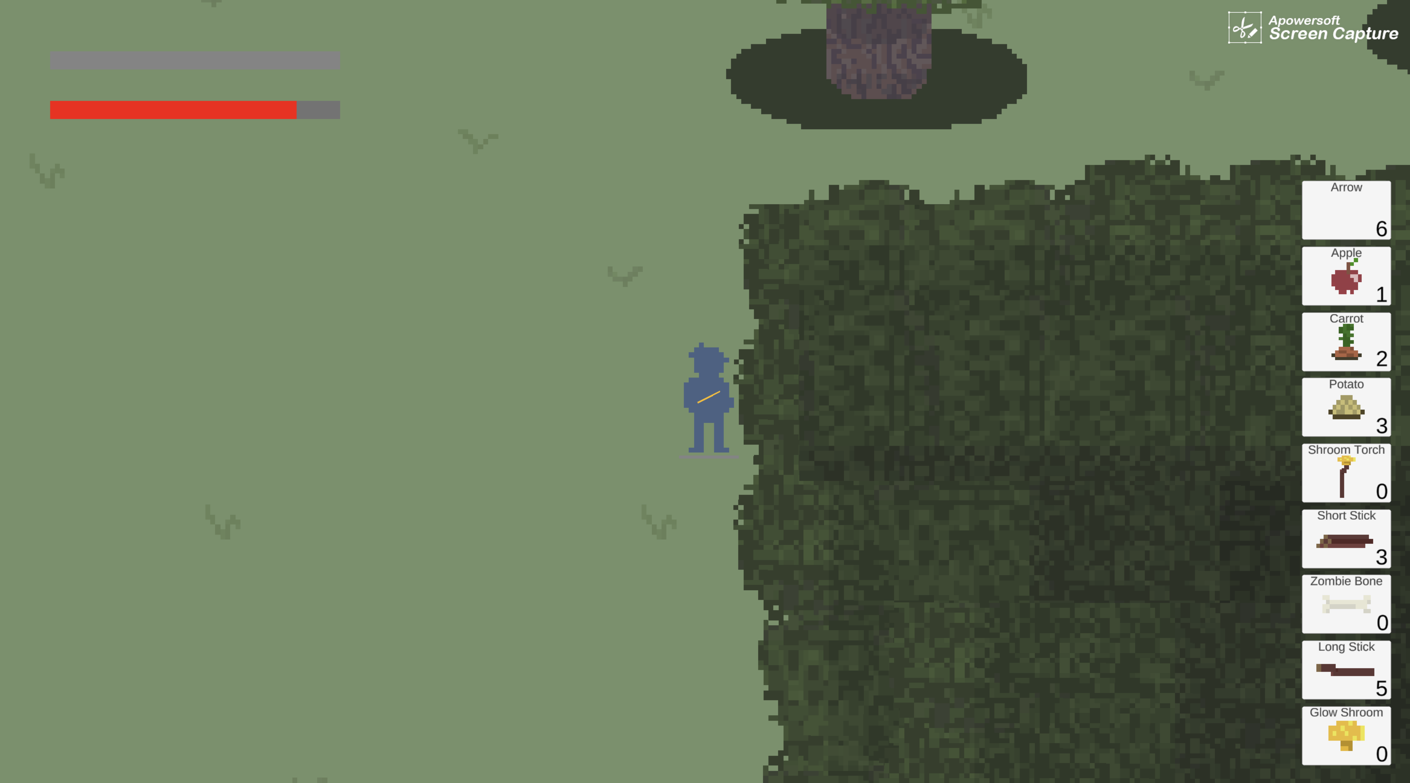
The thick tree border around the outside is just a small section of the trees I made copied and pasted, but darker, and increasing darker toward the edges. I did not want to spend time making the corners so it was a bit of a jigsaw to make them look believable. but in-game, I think it works well - they are designed to take focus away from the exterior of the forest, and I think they succeed.
I am most proud of the collectible items as they really fit the mood of the design and add a lot of depth to the emotion I am trying to portray.
During this week I also added a couple of missing mechanics, including the zombies doing damage over time and the house being able to take damage from zombies. The zombies previously did one attack every time the player re-entered its hitbox, but they now continuously attack until the player exits the hitbox. I was originally planning on the house counting how man zombies were touching it and if it was more than 3 it would be game over. However, I felt it was more fair on the player to give them more of a chance to kill the zombies attacking the house. before they completely destroyed it.
I still have no feedback, but here are some pretty pictures to look at:
Zombie Forager
A top-down, pixel art, survival game all about finding supplies to protect your house from zombies.
| Status | In development |
| Author | Soos92s |
| Genre | Survival |
| Tags | 2D, bow-and-arrow, foraging, Pixel Art, Short, Zombies |
More posts
- Documentation - Post-MortemOct 14, 2022
- Devlog 5 - Music, Sound Effects, UIOct 12, 2022
- Third Devlog - EnemiesOct 01, 2022
- Second Devlog - Level BlockingSep 22, 2022
- First DevlogSep 13, 2022
- Game ConceptAug 25, 2022
Leave a comment
Log in with itch.io to leave a comment.